Smartphone sizes seem to be on the rise as of late. They continue to grow physically, as their stimulations grow in significance to modern life. But is this growth intrusive? Some would suggest that these big screens are interfering with our ability to live healthy lifestyles.

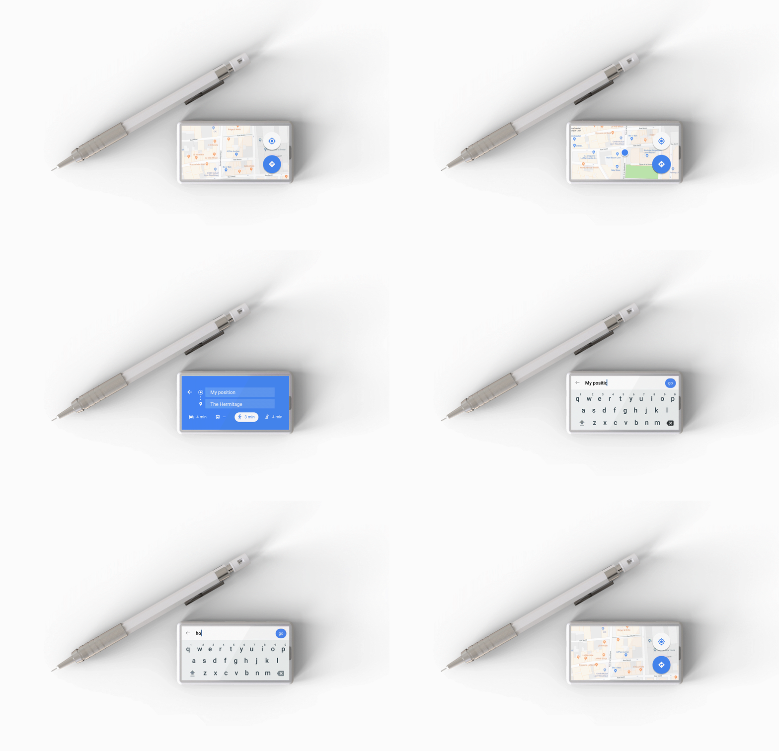
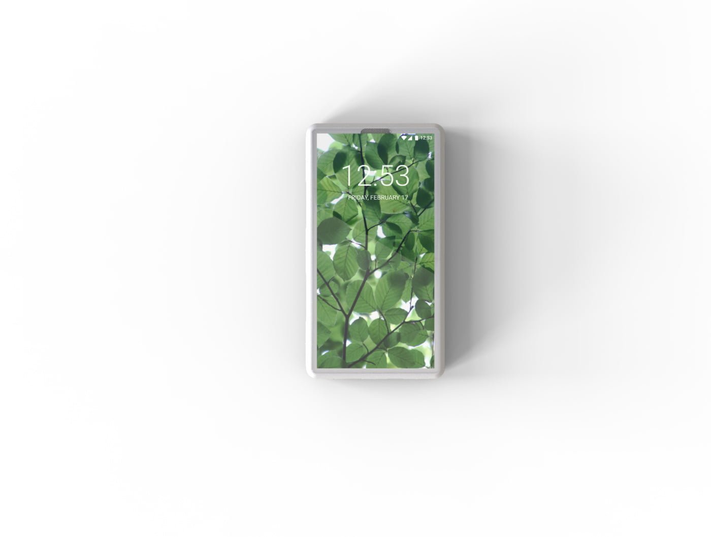
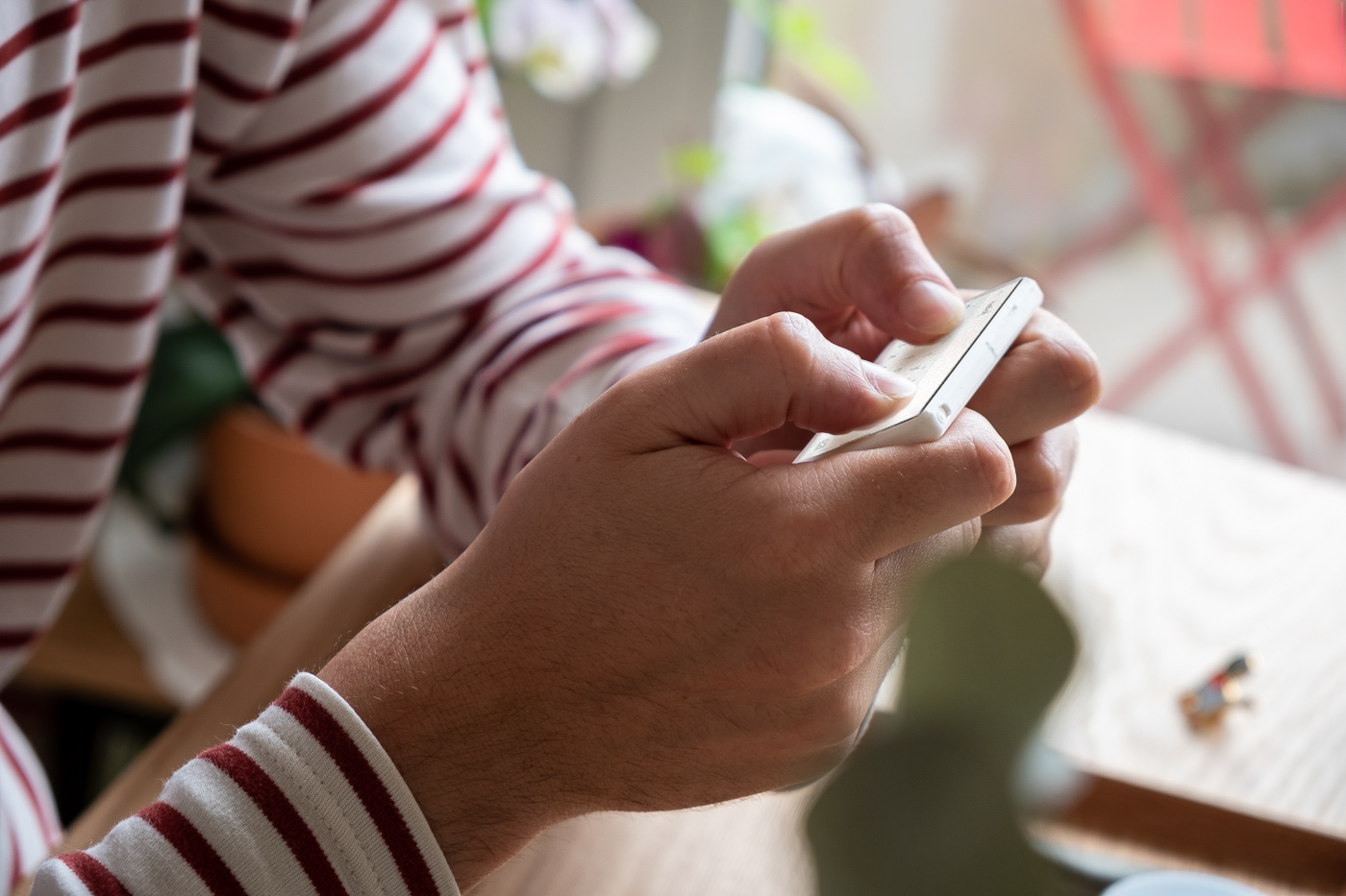
French designer Pierrick Romeuf asks the timeless question for smart phone designers — does size really matter? Perhaps a phone doesn’t require such a large part of our attention, nor such a large amount of space in our pockets. Romeuf designed ‘Minima’. As the name suggests, it’s a miniature smart phone that makes the Nokia look cumbersome. It has a screen size of just 3 inches and rethinks a smartphone’s use — yet, the size isn’t just symbolic. ‘Minima’ is too small for Netflix binging, or obsessive social media scrolling. The smartphone becomes a tool for the user, rather than a portal to a virtual reality or a detrimental distraction.

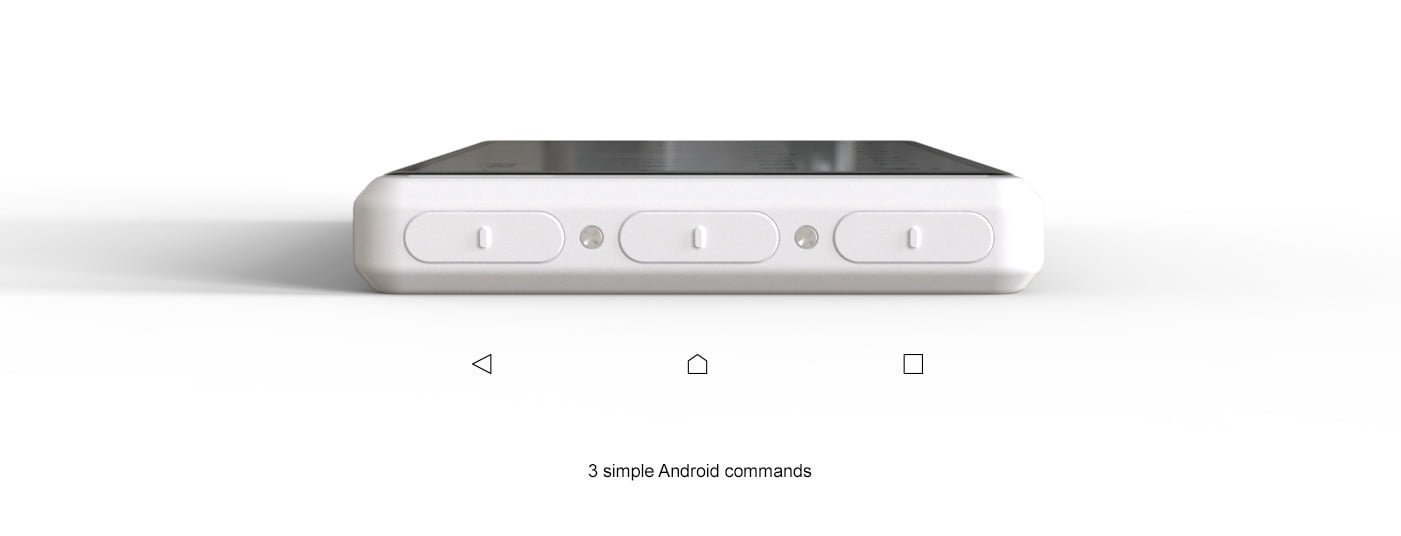
The phone’s discreet minimalist design makes it an effective communication tool in 2018 and perhaps marks a trend for the next decade. Minima works with a hybrid OS, a mix between a smartwatch OS and a smartphone OS in order to fit any apps available on the market, thanks to its 18:9 ratio screen. It reintroduces buttons as part of its intention to turn the phone back into a tool. There are three buttons on the side of the design, each representing an essential function (back, home and camera). On this platform, you’re not required to do any fancy tricks or navigations, it simply requires a click of the button.

By Rob Reuland
Source: https://www.designboom.com/technology/minima-mini-smart-phone-pierrick-romeuf-06-08-2018/

