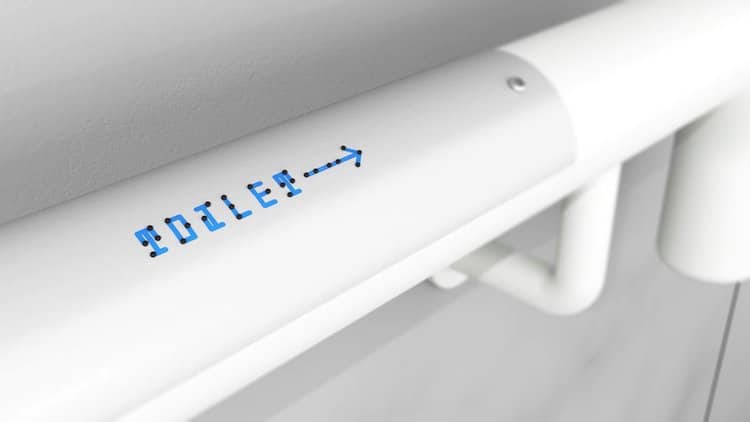
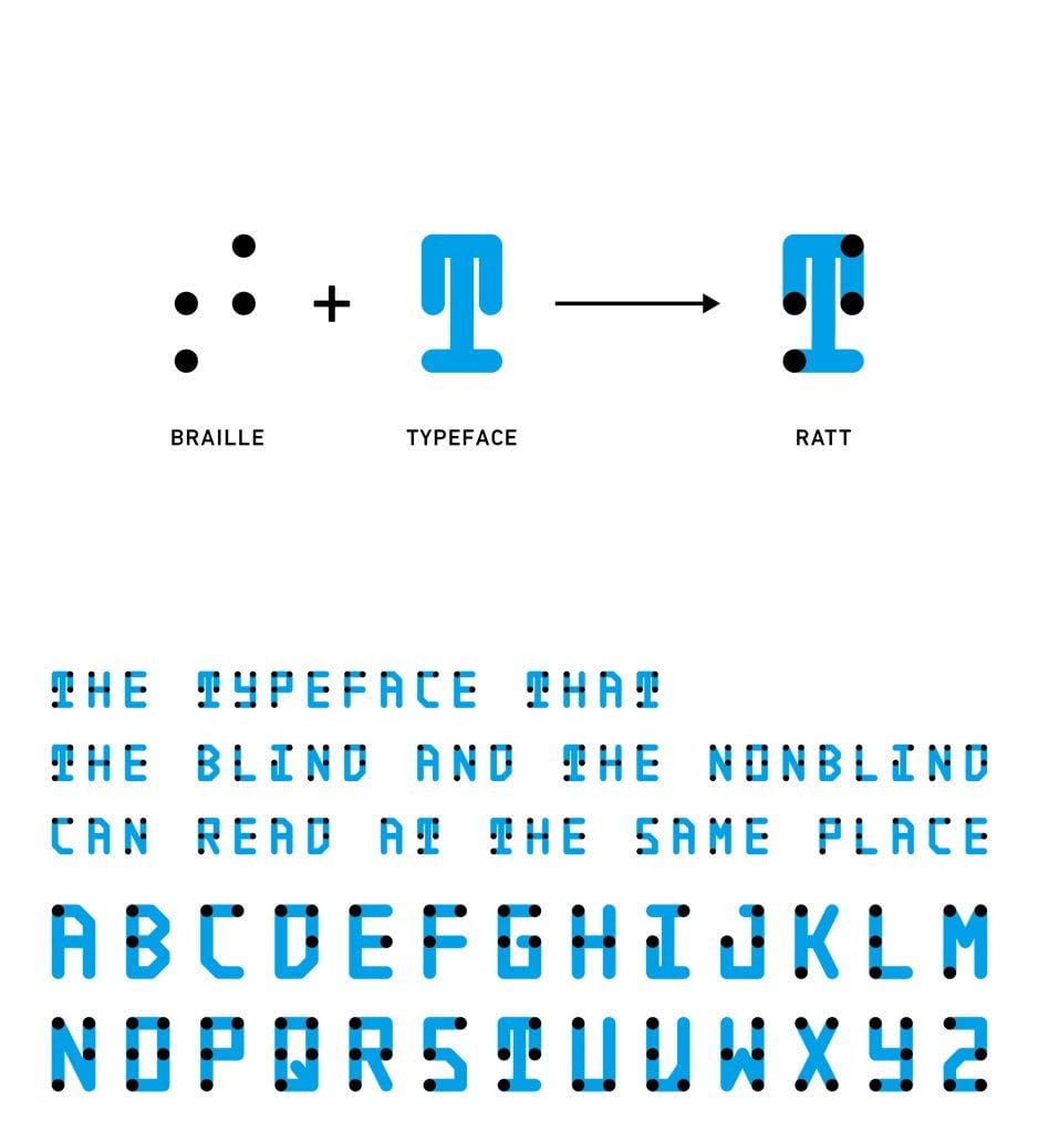
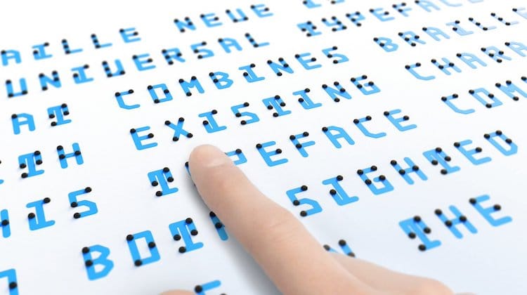
With an innovation that makes you wonder why no one thought of it earlier, Japanese designer Kosuke Takahashi has created a new typeface that allows everyone equal access to information, whether they can see or not. The 24-year-old just released his Braille Neue typefaces, where English and Japanese characters are overlaid with their braille equivalents. His hope is that this will motivate more braille to be included in public spaces, as its inclusion is now often limited due to space restrictions.

Derived from the popular Helvetica Neue font, Braille Neue comes in two styles—Braille Neue standard (English) and Braille Neue outline (English and Japanese). As most sighted people can’t read braille, each font would allow an easier cross flow of information between the sighted and the blind. Takahashi even points out that by kerning Braille Neue outline, existing text could be overlaid in public spaces to make them more accessible to everyone. In fact, Takahashi is hoping it will become a standard during the 2020 Tokyo Olympics and Paralympics.

How did he come up with the idea? Each morning before work, the young designer brainstorms ideas for 30 minutes and puts them in a notebook. Braille Neue originated from a simple question he asked himself—’Why can I not read braille?’ He then prototyped his idea and started collecting feedback both from sighted readers and the visually impaired. Taking on this feedback, he’s been refining the typeface and will continue to make improvements in its legibility and usability.

